Iniciaste sesión como:
filler@godaddy.com

This was a submission for Talenthouse's James Bond: No Time To Die poster competition. The image is taken at the moment Bond's bullet hits the mirror on which you see his reflection. The mirror shatters to form an aerial view of London and the Thames which crosses over the wound in his chest. In lipstick is written "No Time To Die" along
This was a submission for Talenthouse's James Bond: No Time To Die poster competition. The image is taken at the moment Bond's bullet hits the mirror on which you see his reflection. The mirror shatters to form an aerial view of London and the Thames which crosses over the wound in his chest. In lipstick is written "No Time To Die" along with a kiss mark. The image is taken from his first incarnation of the role in Casino Royale.
This was a submission for Talenthouse's James Bond: No Time To Die poster competition. This idea came from the original prompt which was to incorporate all of Daniel Craig's Bond adventures as a celebration of his last appearance as the character. Along with a collection of symbols from his movies, you will also find the contents held bet
This was a submission for Talenthouse's James Bond: No Time To Die poster competition. This idea came from the original prompt which was to incorporate all of Daniel Craig's Bond adventures as a celebration of his last appearance as the character. Along with a collection of symbols from his movies, you will also find the contents held between two clock hands. Lastly you have Bond leaping heroically while being targeted.

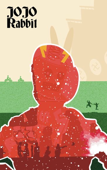
The design is derived from a still in the earlier part of the film. At the time the world is in peril with extremely low temperatures and nature roaming wild as humans no longer live in the surface world. Using the primary colors, blue in this case, I try to portray the frigid temperatures of the area while highlighting the roaming animal
The design is derived from a still in the earlier part of the film. At the time the world is in peril with extremely low temperatures and nature roaming wild as humans no longer live in the surface world. Using the primary colors, blue in this case, I try to portray the frigid temperatures of the area while highlighting the roaming animals in yellow. The title stands out while following in the tradition of action/adventure movies by being bright red and the snow/rain in white pulls all of the elements together.

Silhouette style of famous actor Natalie Wood made with black Sharpie.

Inspired by a Zulu Nation mural in Brooklyn and made with Copic markers.

Classic caricature style image of actress Scarlett Johansson made with Sharpie.


A basic and fun way to introduce you to the sketchbook with a colorful tag using one of my pen names.

5 individual pieces about thinking outside of the box and letting creativity roam free. Each has their own theme.

Police and paramilitary personnel are surrounded by plumes of color being dropped by a white dove effectively "surrounding" a destructive and restricting force in peace and love.

Location is key to this one. In the subway/metro rarely do people take the time to relax and reset, hence the purpose of this piece. Slow down and take a second to absorb the world around you.

Palacio Cristal in January while also serving as an experiment with new software.
This is a blue print I created to scale of a planned, but never created, Frank Lloyd Wright laundromat. There are also some arithmetics on the side as I tried to estimate how much of which materials would've been needed, and how much they would've costed.
Using geometrical figures to create possible shapes within shapes. And then creating one shape with as many shapes as possible inside, totaling 342.
Simple study of how to create perfect circles from triangles and vice versa.

This work was inspired by the many customs of Asian countries. The idea behind it was to point out very different and distinct cultures from specific places in Asia while joining them in harmonious fashion. The dragon is drawn without hands/feet so as to not reveal either its Chinese or Japanese origin. The lantern on the other hand is s
This work was inspired by the many customs of Asian countries. The idea behind it was to point out very different and distinct cultures from specific places in Asia while joining them in harmonious fashion. The dragon is drawn without hands/feet so as to not reveal either its Chinese or Japanese origin. The lantern on the other hand is specifically Chinese with my added flare.The tree is another mixed object. It possesses the body of a Japanese bonsai while displaying the foliage of pink cherry blossoms, again illustrated in my style, which grow famously in China and India as well as Japan. The Japanese wave is a direct reference to Hokusai's wave and the final component is a species of crane found commonly in India.

I drew up the rose to accompany our little garden in the front of our house. To achieve the effect I was aiming for I used a sketchbook technique which allows me to increase depth perception of the main shape painted in solid colors by separating the rose from the surface and extending its contour beyond the geometric shape behind it.

This is my very first mural and it was done as a group project with my little sister (her mural not pictured). The concept was the coexistence of nature and city, and I chose to design and paint the "nature" part of it. My goal was to incorporate the larger aspects of nature into one flowing piece. Here you can see animals, land, water, a
This is my very first mural and it was done as a group project with my little sister (her mural not pictured). The concept was the coexistence of nature and city, and I chose to design and paint the "nature" part of it. My goal was to incorporate the larger aspects of nature into one flowing piece. Here you can see animals, land, water, air and sun all represented. Also, above and to the left you will see my final sketch (done digitally).

Inspired in part by Hemingway's novel "The Old Man and the Sea" we have a calm Santiago fishing amidst a very active sky and sun. The tackle on the end of the fishing line is drawn as if it were thrown toward the viewer in an attempt to show depth and the third dimension in a relatively tight space. Also notice Santiago's bright sea blue eyes inspired by a famous passage from the novel.

This ball was made from banana leaves, white rubber bands, and white orchids. all three materials exist in Nigeria's vast rain forest and they come together to make the colors of the Nigerian flag.
Inspired by South Africa's ancient civilization, the Khoisan, and modern Johannesburg building techniques, I created a ball made entirely from dirt (and a foam core) and painted it with a dot pattern exhibited on Khoisan art.

Rio's vibrant culture is represented with the various colors painted on deconstructed soccer ball parts. The rest is held together by Brasilian banana leaves which are also decorated with similar designs meant to represent the colors of the sky at sun rise and set. On each side of the ball there are two diamond shaped pieces with the colo
Rio's vibrant culture is represented with the various colors painted on deconstructed soccer ball parts. The rest is held together by Brasilian banana leaves which are also decorated with similar designs meant to represent the colors of the sky at sun rise and set. On each side of the ball there are two diamond shaped pieces with the colors and designs of Rio's four teams; Flamengo, Fluminense, Vasco de Gama, and Botafogo.
Inspired by Tokyo's revolutionary recycling system, this ball was made entirely from plastic bags. Samurai blue rubber bands hold the ball together, the hexagonal panels are meant to represents freestyle football's origin and popularity in Japan, while its pink silk fringes utilize a traditional Asian fabric while creating